It is easy to fall prey to décor slip-ups when you’re not an interior decorator. Here are some common errors that anybody can easily make. So, take notes and stay away from these faux pas.
Floating rugs
It’s likely that you spotted a gorgeous rug at a furnishings store during one of your travels or while browsing online. You look at the price and decide to buy a small size because that fits your budget best. That, there, is an outright rookie mistake! A rug that is eye-catching and beautiful, but looks stranded in the middle with furniture pieces floating around it, is a waste and makes the room look disproportional.
FIX IT:
A rug is supposed to ground the room and anchor the furniture around it. It is meant to tie the different elements in the room together. So the rule of thumb is to pick a rug that is big enough, so that the front feet of the furniture around it can rest easily on it. Measure the area where you want the rug to be placed and make your purchase accordingly. The right rug will not only help the room achieve a sense of balance, but will also make it feel larger.
Hanging artwork a bit too high
You’ve framed a rare oil painting or some spectacular travel photographs for that blank wall. But if you’ve hung them too high, it’s easy for others to miss or think they are floating tiles on the wall!
FIX IT:
The optimal height to hang an artwork is at eye level or about 60 inches from the ground, which is the height of an average person. This means that the centre of your paintings should be at that level, not the top of the frame. Mark an outline of the frame with tape and step back—if you’re not bending your neck too much to look at the outline, whether sitting or standing, that’s where you would want to hang the painting.
Resorting to a single source of light
Lighting is a key element while designing any room. In fact, even a gorgeous room can end up looking disastrous if the lighting is too minimal or harsh. Resorting only to artificial lighting, rather than using natural light to your room’s advantage, is another common mistake.
FIX IT:
Make room for as much natural light as possible. Enhance it by using mirrors in the room. For times when natural light is not possible, play with flattering lights from different mediums. For instance, a mixture of soft lights from lamps at different levels and overhead fixtures work brilliantly. Also, avoid hanging a light fixture too low, unless it’s a chandelier above a piece of furniture, like your dining table.
Pushing back furniture
This is something that comes naturally to most people. Once the furniture for the room has been procured, and the arranging begins, one tends to push the furniture back up against the walls to create an outline, and other elements are then positioned accordingly. This is also done due to the misconception that a room looks bigger as a result. But unless you want to create space in the middle for a performance or a dance party, avoid doing this. The space in the middle does not reflect breathing space, instead it ends up looking awkward.
FIX IT:
Bring your furniture a few inches away from the wall. In fact, if the room is large, bring it a lot more inside. Make your room look intimate by creating conversation points. You could do this by angling some of your furniture or placing a few pieces away from the others. Ensure at least 2 to 3 feet space between your furniture to allow easy flow of movement rather than restricting everybody to one area.
HOARDING SPACES
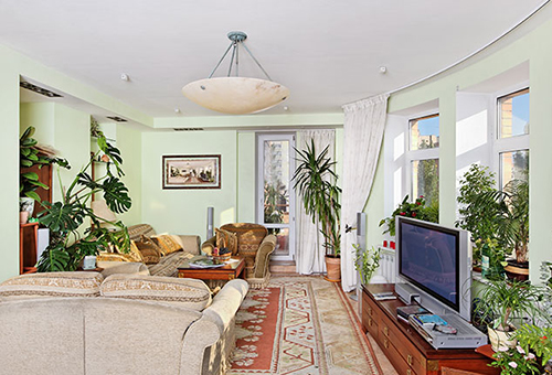
It has been rightly said that too much of anything is bad. The same applies to home-decorating. Just because you have an empty space on the mantelpiece doesn’t mean that you need to display 10 framed photographs on it. Similarly, even if you have a large room, it doesn’t mean that you have to crowd it with a lot of pieces of furniture. Displaying all your souvenirs or crystal pieces can clutter your space and become distracting.
FIX IT:
Look at your room and spot the busy areas. Select things that you can do without and pack them away. If storing them tugs at your heart, bring them back after a few months, but not before you remove other items. This is a great way of redoing your space now and then. Spread out your knick-knacks in different areas or take some to another room. Pick items that add harmony to a corner rather than making a mess.
Hanging curtains too short or too long
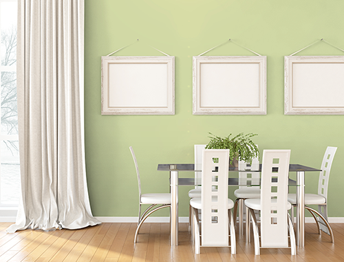
Curtains are another element that can have an instant impact on your room, especially if they are shorter or longer than the ideal length. Hanging short curtains makes them look cheap and out of place while longer ones look shabby.
FIX IT:
Curtains must either kiss the floor or fall about half an inch above it, so that they give an illusion of touching the floor. This also helps in easy moping! If you’ve, however, already bought curtains that are falling short, see if there’s scope for tailoring amendments. If not, resort to attaching creative curtain ends. Curtains that are longer than the ideal length tend to look shabby. Opt for ones that kiss the floor or that fall about half an inch above it.
Displaying ugly backs in the front
First impressions are always the last. So you don’t want someone to walk into your room and be greeted with unattractive backs of chairs or sofas. The rest of the room may look gorgeous— heck even the front of those chairs maybe appealing—but if the ugly backs are what a person notices first, the sight will definitely leave a bad taste.
FIX IT:
Rearrange your furniture and place the particular chairs or sofas to a different corner so that the backs are hidden and away from sight. Stand at the front of your room, identify what is the first thing you see and make sure that it is appealing to the eye. Another trick is to reupholster the back of your chairs with prettier fabrics. This way, you can stick to your original layout.
Matching everything
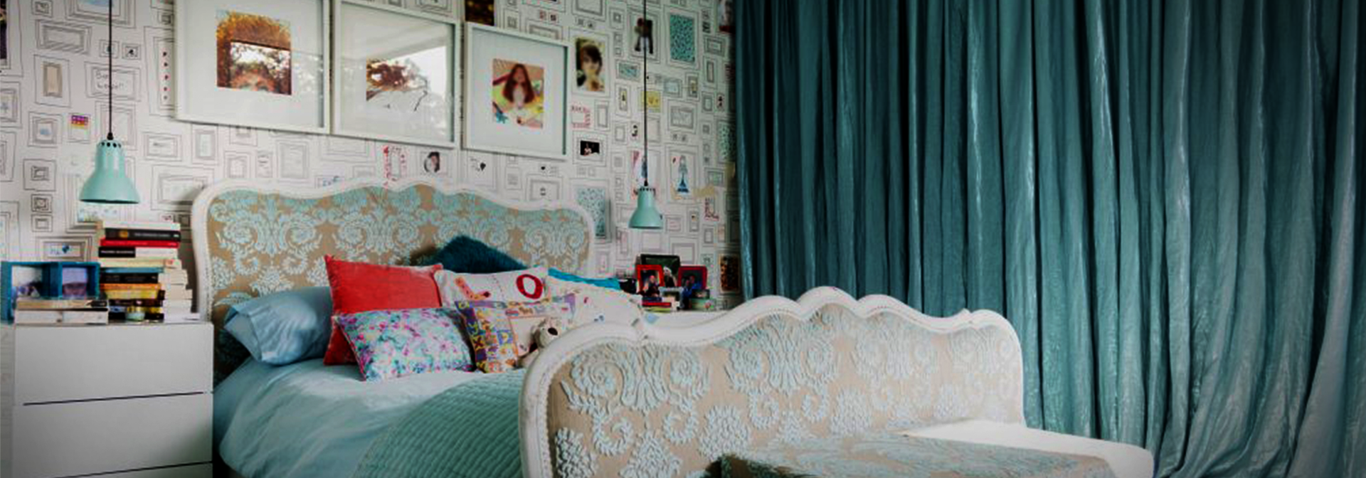
One of the easiest ways to ruin a room is to have everything matching in it. From every piece of furniture matching the other (true in case of large sets), to the wall paint matching the curtains and the bed covers, to having pairs of everything—these are quickest ways to strip a room of any personality. This is especially true of kids’ rooms where, in an effort to stick to a theme, elements tend to repeat.
FIX IT:
Play with textures, patterns and colours from other items and add depth to your room by throwing in cushions, throws and rugs that are a different pattern or colour altogether. Avoid more than two pieces of furniture that look the same. For instance, you could have a sofa in a solid colour and the other in a pattern of a different colour. Break up pairs and use them around the room. It’s okay to have a base colour for the room but keep it subtle.
Keeping large plants in the way
Plants are great! When your room is finally designed and decorated, adding greenery only takes it a notch up. Plus, they purify the air indoors and have a calming effect on people. But the calm can turn into quite a nuisance if the plants brush against you constantly.
FIX IT:
Clear your entry way of any plants that have spiky branches or ones that spread out and come in the way of normal movement. Make sure that the ones placed next to the seating areas don’t graze against you when you are relaxing. You want people to admire your greens, not get annoyed by them. Keep them at a place where they’re not a bother and where people are able to see and appreciate them. You could also resort to smaller plants or beautiful displays like terrariums or succulents.
Ignoring scale
The word ‘scale’ might sound daunting but it is an easy concept to grasp and getting it right can help you decorate much better. Whether this pertains to your furniture, wall art or any other element, having something too big in a small room or something too small in a large room can throw the room off balance completely.
FIX IT:
It’s quite simple really: If you have a small room, use smaller furniture or even low-slung sitting; if you have a large, open space, feel free to use chunkier pieces. Just ensure that you don’t crowd the room. Remember that scale doesn’t pertain to only connecting the elements of your room to the size of the room; it also means relating pieces of furniture to each other. A side table that is at the height of the couch next to it is going to look weird. Instead, make sure that it is a few inches lower than the sofa’s arm height.
Home calculations made easy to help you plan your home
MISSED CALL
Give us a MISSED CALL for New Home Loan
- 09289200017
